Civilization has changed its energy substrate four times, and the record runs in decades
Every large civilization has run on one dominant energy substrate at a time, and every switch away from one has been slow enough to span careers, not election cycles. Wood gave way to coal, coal gave way to oil and gas, and oil and gas began, only in the last two decades, to face a genuine rival in electricity generated directly from sunlight and wind. None of these substitutions happened because the incumbent stopped working; each happened because a new lineage arrived whose costs moved in a direction the old one’s never did, and out-competed it on the metric that actually clears markets: delivered cost per unit of useful energy.
The clearest empirical starting point for that claim is not a historian’s narrative but a set of cost and deployment curves assembled by Rupert Way, Matthew Ives, Penny Mealy, and J. Doyne Farmer, published in Joule in 2022 and built at Oxford’s Institute for New Economic Thinking together with the Smith School of Enterprise and the Environment and the Santa Fe Institute [1]. Their Figure 1 lays 140 years of primary-energy costs and production side by side, and the pattern it shows is a split into two populations, not a single trend. One population — oil, coal, and gas prices, plus the fifty-year commercial history of carbon capture and storage — has essentially flat, inflation-adjusted costs over a century or more; the paper calls this a “running-to-stand-still” dynamic, in which technological progress in extraction is continually offset by the depletion of easily accessible resources, so that unit cost barely moves even as the underlying engineering keeps improving [1]. The other population — solar photovoltaics, wind turbines, and batteries — has dropped in cost roughly exponentially, at a rate the paper puts near ten percent per year for multiple decades running, with solar PV specifically down by more than three orders of magnitude since its first commercial use in 1958 [1]. Nuclear power, deployed on a schedule superficially similar to the exponential rise of these newer technologies during the 1970s, sits with the first population instead: its costs have consistently risen rather than fallen, the one clean-firm exception this record actually documents [1].
Vaclav Smil’s independent argument about technological pacing supplies the reason to expect exactly this kind of split rather than a single smooth trend across all energy hardware. Writing in IEEE Spectrum under the title “Moore’s Curse,” Smil showed that the physical machinery civilization actually runs on improves nothing like a semiconductor: the thermal efficiency of steam turbogenerators rose only about 1.5 percent a year across the entire twentieth century, and even the more favorable comparison — 1900s steam turbogenerators against 2000s combined-cycle gas plants pairing turbines with steam boilers — yields an annual rate of only 1.8 percent; the energy cost of producing a metric ton of steel fell from roughly 50 gigajoules to under 20 between 1950 and 2010, an annual rate of about 1.7 percent [9]. Those are the improvement rates of civilization’s heavy, capital-intensive, thermodynamically constrained energy backbone — the same backbone whose fuel costs, per Way et al.'s data, do not trend down at all. Solar, wind, and batteries are the exception to Smil’s rule precisely because they are not thermodynamically bound heat engines; they are manufactured, modular products whose unit economics respond to cumulative production the way semiconductors and fiber optics do — Way et al. note that optical fiber and transistor costs have historically improved at 40 to 50 percent per year, a rate solar, wind, and batteries approach without quite matching [1]. A new lineage entered the energy population carrying a manufacturing-economics trait the incumbents structurally cannot express, and that trait, not any policy preference, is the reason this substitution looks different from the three before it.
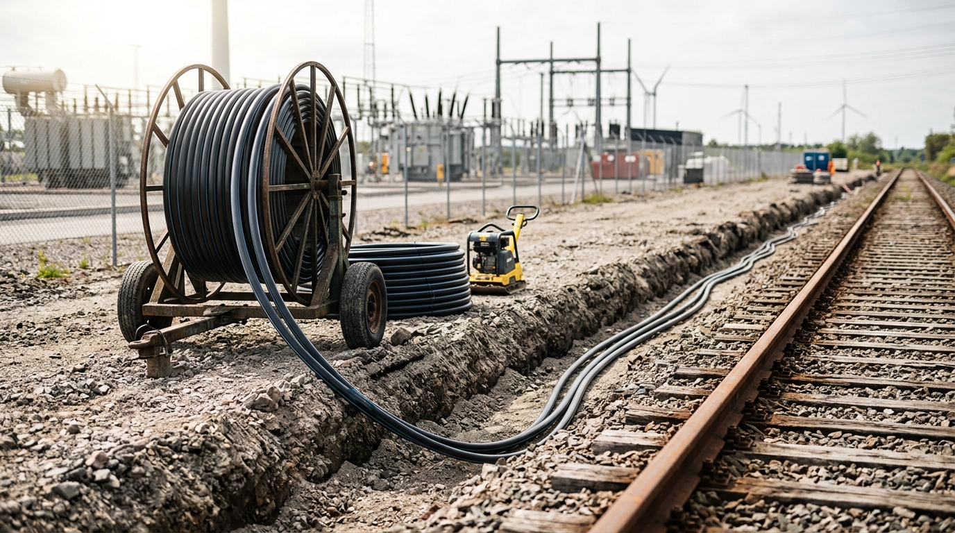
The deployment side of the record is just as telling as the cost side. Way et al. report that global solar PV production grew at an average of 44 percent per year over the three decades to 2022, while wind grew at 23 percent per year over the same span [1] — rates that, sustained for a decade, turn a rounding error into a fifth of a system, which is close to what has already happened to electricity generation in the countries that adopted earliest. The historical pattern of a technology’s diffusion curve — slow uptake, followed by explosive growth as manufacturing and installation experience compound, followed eventually by tapering as it saturates its available market — is not new; the S-curve is one of the oldest observed regularities in the diffusion of any new technology or trait through a population, biological or technological [1]. What is new, on the empirical record assembled here, is that solar, wind, and batteries are the first energy technologies observed to combine that S-curve deployment pattern with a sustained, multi-decade exponential cost decline rather than the flat or rising costs that every prior dominant energy source, including nuclear, eventually settled into. That combination is what the rest of this article treats as the decisive fact requiring an explanation — and the explanation the data supports is Darwinian in shape even though the mechanism is economic: heritable variation in a cost trait, exposed to a selection pressure that rewards it compounding.
Forecasters missed photovoltaics because they fitted a straight line to an exponential process
If solar’s cost decline were merely fast, it would be a curiosity. What makes it consequential for this article is that the institutions responsible for planning the global energy transition — national energy agencies and the integrated assessment models that feed the Intergovernmental Panel on Climate Change — spent roughly two decades getting the direction of that decline right and the magnitude wrong, in the same direction, repeatedly, and the size of the miss is documented rather than asserted.
The clearest single number comes from Felix Creutzig, whose research on the underestimation of solar’s mitigation potential he summarized directly for Carbon Brief: across 1998 to 2010, projections resembling the International Energy Agency’s implied a photovoltaic growth rate of 16 to 32 percent per year, while the technology’s actual annual growth over that period ran from 20 to 72 percent, averaging 38 percent — and even the environmental advocacy group Greenpeace, whose 2007–2010 projections of 24 to 32 percent per year were explicitly built to be optimistic relative to mainstream agency forecasts, were still exceeded by what actually happened [6]. The gap compounds ferociously over a decade: Creutzig notes that a 19 percent annual growth rate compounds to roughly 470 percent growth over ten years, while a 38 percent rate compounds to roughly 2,500 percent — the same start and end points, an order of magnitude apart, purely because a forecaster used a linear-feeling percentage instead of tracking the technology’s actual doubling behavior [6].
Way et al. document the same failure from the cost side, with a precision that turns “underestimated” into an audited number. The AMPERE model-comparison project collected 2,905 separate projections from nine integrated-assessment-model teams for how fast solar PV investment costs would fall between 2010 and 2020; the mean projected annual rate of decline across every one of those 2,905 scenarios was 2.6 percent, and every single scenario projected less than 6 percent per year. Solar PV costs actually fell by 15 percent per year over that decade — two and a half times the fastest rate any of the 2,905 professional projections considered plausible [1]. The paper’s Figure 3 plots every PV levelized-cost-of-electricity projection the IEA has published in a World Energy Outlook since the first one appeared in WEO 2001, alongside every “high-progress” integrated-assessment-model projection reported in 2014 and 2018, against the observed cost trajectory; the observed line runs consistently and substantially below all of them, including the versions its authors flagged as their most aggressive, most climate-friendly cases [1]. Most tellingly, Way et al. report that this is not a corrected, historical embarrassment: the projections feeding the IPCC’s own AR6 scenario database, current as of the paper’s 2022 publication, “have so far exhibited the same upward bias seen previously” — the institutional forecasting error, as best this article’s sources can verify, had not yet been fixed even in the most recent official climate-scenario compilation available at the time [1].
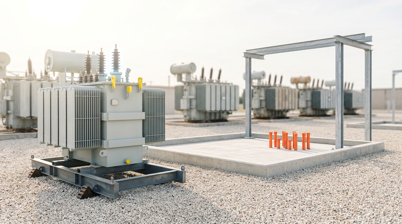
The mechanism behind the miss is a modeling choice, not a mystery, and Way et al. name it directly. Integrated assessment models generally use a form of Wright’s law — the empirical relationship, formalized in 1936, in which a manufactured good’s unit cost falls as a power-law function of cumulative production rather than of calendar time — but they pair it with what the paper calls “ad hoc constraints,” most importantly deployment-rate limits and cost floors, imposed because unconstrained Wright’s-law extrapolation can otherwise produce cost declines that look implausibly fast to a modeler working from intuition rather than from the historical record itself [1]. The paper’s own Figure 3 shows those floor costs, plotted by the year each was published, being violated by observed PV system costs again and again, and states plainly: “we know of no empirical evidence supporting floor costs” [1]. The deeper diagnosis is a category error familiar from any exponential process misjudged by a linear intuition: early in an S-curve’s exponential phase, percentage growth rates look almost indistinguishable from noise around a slow trend, and a forecaster extrapolating “the trend so far” linearly will keep being surprised, at almost every checkpoint, by a curve that was never linear to begin with. Béla Nagy, J. Doyne Farmer, Quan Minh Bui, and Jessika Trancik formalized the statistical machinery for testing this directly against fifty years of data across dozens of technologies, and their 2013 backtest exercise for photovoltaics — built entirely from data available before 2010 — forecast a 2020 cost of six cents per kilowatt-hour with an explicit ninety-percent range of three to twelve cents, a forecast made using the same experience-curve family Way et al. later systematized, rather than the deployment-constrained models institutional forecasters were using at the time [2]. A forecaster who trusts the doubling relationship instead of the calendar gets closer, and gets there with an honestly stated error bar instead of a floor nobody has observed in the data.
Cost is the fitness function, and the learning rate is the heritable trait natural selection is acting on
Treat “levelized cost of electricity” as this ecosystem’s fitness function and the rest of the argument follows the shape evolutionary biology uses for any trait under sustained directional selection. A population of competing energy technologies is exposed to one pressure — buyers and grid operators choosing the cheapest reliable source available to them — and the trait that determines long-run success under that pressure is not today’s cost, which is a snapshot, but the rate at which cost falls as the technology accumulates deployment experience. Call that rate the learning rate: the percentage cost reduction observed every time cumulative production doubles. It is heritable in the relevant sense because it is a stable property of a technology’s manufacturing and engineering character, carried forward from doubling to doubling with only modest drift, in exactly the way a biological trait’s heritability describes how reliably a parent’s value predicts an offspring’s.
The formal relationship goes back to Theodore Wright’s 1936 observation that aircraft manufacturing labor hours fell as a power-law function of the number of airframes already built, and Way et al. build their entire forecasting method on a stochastic version of it, fitted to more than fifty technologies’ historical cost and production records [1]. Written in its cleanest form, cost
where the experience exponent
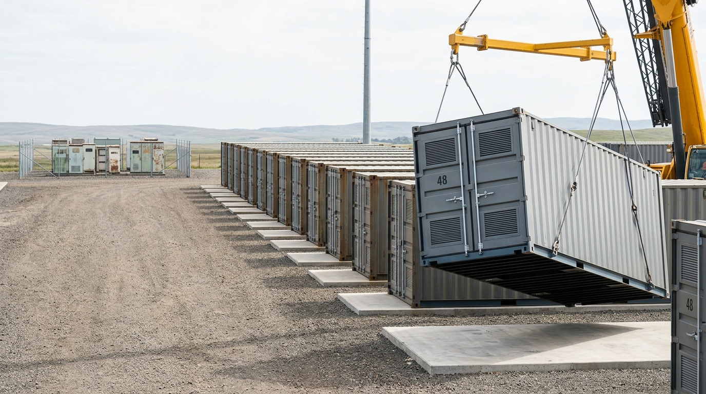
The measured learning rates for this article’s three “key green technologies,” in Way et al.'s own phrase, are now pinned down by more than one independent source. Max Roser’s synthesis for Our World in Data, citing the experience-curve study by de La Tour, Glachant, and Ménière, puts the photovoltaic module learning rate at 20.2 percent per doubling of cumulative capacity, with onshore wind at 23 percent and offshore wind at 10 percent over the 2010–2019 period specifically, and notes that solar’s levelized cost of electricity — a broader measure than the module alone, since it folds in installation, financing, and balance-of-system costs — fell even faster over that decade, at a learning rate of roughly 36 percent per doubling [7]. Batteries carry a comparable rate: Hannah Ritchie and Pablo Rosado’s 2026 update for the same publication finds that lithium-ion battery pack costs have fallen by 19 percent for every doubling of cumulative global production since 1998, a relationship stable enough across nearly three decades of data to produce a cumulative price decline of 99 percent over that period [8]. These numbers are not identical to Way et al.'s roughly-ten-percent-per-year figure, and the difference is instructive rather than contradictory: a learning rate is a rate per doubling of cumulative production, while Way et al.'s ten percent describes the rate per year of calendar time — the two only translate into each other once you know how fast cumulative deployment is itself doubling, which is exactly the S-curve deployment data from the previous section. A technology can hold a constant twenty-percent learning rate per doubling and see its calendar-time cost decline accelerate, decelerate, or even briefly reverse, purely as a function of how fast the population underneath it is growing — which is precisely why Way et al. warn that mid-2000s and pandemic-era supply shortages produced real, temporary cost increases for solar even while its underlying experience curve kept its long-run slope intact [1].
The evolutionary reading sharpens on the comparison the paper draws explicitly between its two technology populations. Coal, oil, and gas prices, and carbon capture and storage’s flat fifty-year cost record, show what happens to a lineage with essentially zero heritability in this trait: whatever effort and investment goes in, the offspring generation’s unit cost does not reliably improve, because the “running-to-stand-still” dynamic of resource depletion cancels out whatever manufacturing or extraction learning does occur [1]. Nuclear power is the more uncomfortable case for a simple story, because it is not a commodity extraction industry at all — it is a manufactured, engineered technology that, on this evolutionary reading, should behave like solar and wind. It has instead shown rising costs over its deployment history, a negative learning rate, which this article treats as an observed fact about nuclear’s specific historical cost trajectory rather than a claim that manufactured technologies are always negatively selected against complexity; regulatory change, site-specific engineering, and stop-start deployment schedules are all live candidate explanations in the literature this article’s sources do not fully adjudicate, and none of them is asserted here as settled.
Three named futures, not one forecast, bound what the arithmetic permits by 2100
A learning rate compounding for seventy-five years does not produce one number; it produces a distribution, and the honest way to describe 2100 is with more than one internally consistent, attributed scenario rather than a single point forecast dressed up as consensus. Three genuinely distinct forecasting frameworks bear on this question, built by different institutions using different methods and answering different questions, and none of the three should be quietly translated into the others.
Way et al.'s three deployment scenarios. The Oxford team’s own forecast is not a single number but three explicit, dated deployment pathways run through their probabilistic Wright’s-law cost model: a Fast Transition, in which fossil fuels are effectively phased out of the energy system by around 2050; a Slow Transition, consistent with the same phase-out completing around 2070; and a No Transition scenario, in which fossil fuels continue to dominate the energy system for decades, growing only slowly displaced by low-carbon sources [1]. The paper’s headline result compares the net present cost of each pathway through 2070: using the 1.4 percent social discount rate recommended by the Stern Review, the Fast Transition’s expected net cost saving relative to No Transition is roughly twelve trillion dollars; at a higher five percent discount rate the expected saving is roughly five trillion dollars; and the probability that the Fast Transition ends up cheaper than No Transition is about 80 percent regardless of which discount rate is used, rising to 82 percent when compared against the Slow Transition specifically [1]. The paper also tested a fourth, nuclear-dominant pathway as a deliberate contrast case, and found it roughly twenty-five trillion dollars more expensive than No Transition at the same 1.4 percent discount rate — a costed, falsifiable rejection of one candidate lineage rather than a value judgment against it [1]. Indicators to watch by 2035: whether global solar, wind, and battery deployment stays within a factor of two of the Fast Transition trajectory Way et al. plot in their Figure 4, and whether the historical roughly-ten-percent-per-year cost decline for these three technologies continues, decelerates toward zero, or reverses for more than two consecutive years. Falsifier: if by 2035 deployment has fallen persistently below the Slow Transition pathway’s trajectory, or if the measured learning rates for solar, wind, or batteries have dropped by half or more from the rates reported above for a sustained multi-year period, the Fast Transition scenario as specified is disconfirmed.
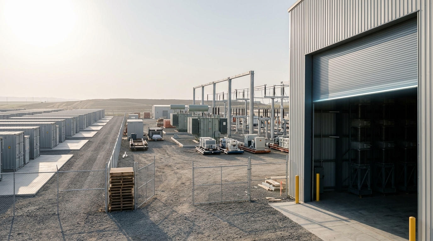
The IEA’s scenario family. The International Energy Agency’s own World Energy Outlook, its central annual planning document, is built around named exploratory and normative scenarios rather than one projection: a Current Policies Scenario and Stated Policies Scenario that extrapolate existing and announced government policy, and a Net Zero Emissions by 2050 scenario constructed backward from a climate target rather than forward from current trends, explicitly framed by the agency as one way of exploring “central choices, consequences and contingencies,” not a prediction [3]. The IEA’s own companion report on renewables states that global renewable capacity additions are on a trajectory to reach almost 940 gigawatts a year by 2030, with new solar capacity specifically accounting for eighty percent of that growth between the report’s publication and 2030 [4] — a figure worth reading against the forecasting-error record above, since the IEA’s own Stated Policies Scenario is the direct institutional descendant of the same modeling family whose PV cost projections Way et al. document as having missed the actual trend for two decades running. Indicator to watch by 2035: whether the IEA’s Stated Policies Scenario for solar deployment continues to require upward revision in each successive annual World Energy Outlook, the pattern documented through 2022 [1] [6]. Falsifier: if a Stated Policies Scenario vintage from 2027 or later projects solar deployment growth at or above the actual trailing-decade rate, rather than below it, the systematic-underestimation pattern this article documents has ended.
The IPCC’s illustrative SSP pathways. The IPCC’s Sixth Assessment Report frames its physical-climate projections around five illustrative emissions scenarios, each pairing a Shared Socioeconomic Pathway narrative with a target level of radiative forcing in 2100, and the resulting temperature ranges are stated with unusual precision in the report’s own Table SPM.1: relative to 1850–1900, global surface temperature over 2081–2100 is assessed at a best estimate of 1.4°C (very likely range 1.0–1.8°C) under the very-low-emissions SSP1-1.9 pathway, 1.8°C (1.3–2.4°C) under the low-emissions SSP1-2.6, 2.7°C (2.1–3.5°C) under the intermediate SSP2-4.5, 3.6°C (2.8–4.6°C) under the high-emissions SSP3-7.0, and 4.4°C (3.3–5.7°C) under the very-high-emissions SSP5-8.5 [5]. These pathways answer a different question than Way et al.'s cost scenarios do — they describe emissions and forcing trajectories tied to broad socioeconomic narratives, not energy-system cost-optimization under a specific technology-learning model — and this article does not assert a one-to-one mapping between, say, Way et al.'s Fast Transition and SSP1-1.9, because the sources verified here do not establish one. What the two frameworks share is a dependency on the same underlying fact: which learning-rate regime for solar, wind, and batteries actually plays out this century is a primary input to which of the IPCC’s forcing pathways the world’s actual emissions trajectory ends up resembling, even though the SSP scenarios were not built by iterating on Way et al.'s cost model. Indicator to watch by 2050: cumulative CO2 emissions tracked against the IPCC’s own remaining-carbon-budget accounting for the SSP1-1.9 and SSP1-2.6 pathways specifically. Falsifier: the IPCC’s own framing already supplies one — global warming of 2°C is assessed as extremely likely to be exceeded under SSP2-4.5 or worse, so observing warming held below 2°C through 2100 would itself falsify the claim that the world is tracking those two intermediate-or-worse pathways [5].
Fusion has not entered this population yet, and it must beat a target that keeps moving
An evolutionary population is not just the lineages currently competing; it also includes lineages that have not yet successfully invaded, and fusion power is the clearest such case in the energy system today. No commercial fusion plant has delivered electricity to a grid, which means fusion has no learning curve in the Wright’s-law sense described above — no cumulative-production history to plot, no measured learning rate, no doublings behind it — because a learning curve requires a population of deployed units to have already been built and improved on, and fusion’s population size, in serial commercial units produced, is still zero.
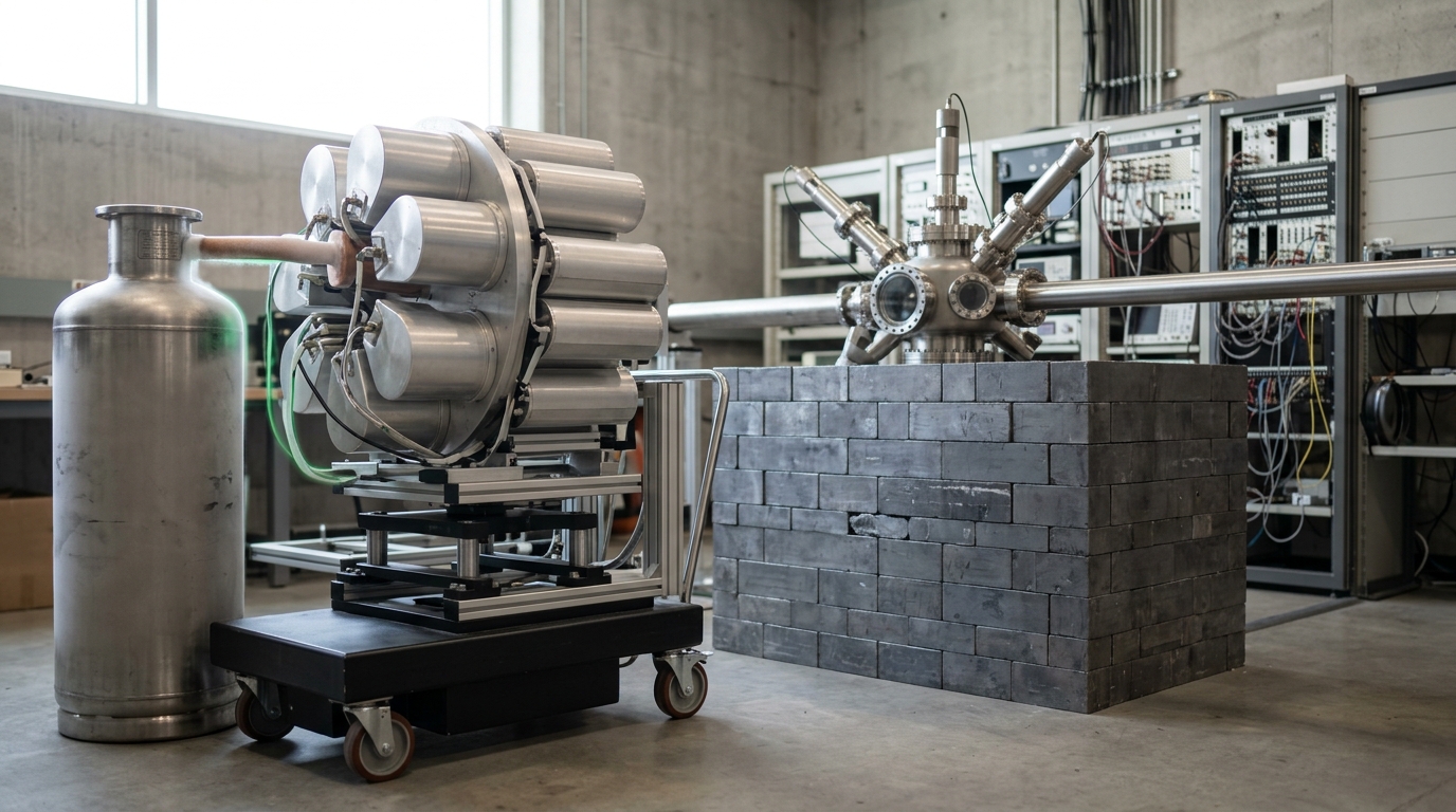
What fusion has instead is a set of named, dated claims made by the companies racing to build the first one, and this article treats every one of them as exactly that: a vendor’s claim about its own product, not an independently verified achievement. Commonwealth Fusion Systems states on its own technology page that SPARC, the tokamak device it is currently building, is intended to “become the world’s first commercially relevant fusion energy machine to produce more energy from fusion than it needs to power the process” — a net-energy, Q-greater-than-one demonstration — by 2027, with SPARC’s designated successor, a plant the company calls ARC, intended to “put power on the grid”; the company’s own page gives no specific target date for ARC itself [10]. Helion Energy has taken a different public commitment: in a power purchase agreement announced with Microsoft, Helion’s founder stated that “Microsoft has agreed to purchase electricity from Helion’s first fusion power plant, scheduled for deployment in 2028” [11]. The company’s own homepage, checked as of this writing, states that its Polaris device achieved what it calls “the first privately developed fusion energy machine to demonstrate measurable deuterium-tritium fusion” on 13 February 2026, and separately describes a further device named Orion as “building the world’s first fusion power plant,” again without a stated date on the page itself for Orion’s completion [12]. Every one of these is a claim by an interested party about a future event; none of them is this article’s forecast, and each carries its own explicit falsifier — CFS’s claim is falsified if SPARC has not demonstrated net energy gain by the end of 2027, and Helion’s is falsified if no electricity from a Helion plant has reached a purchaser’s meter by the end of 2028.
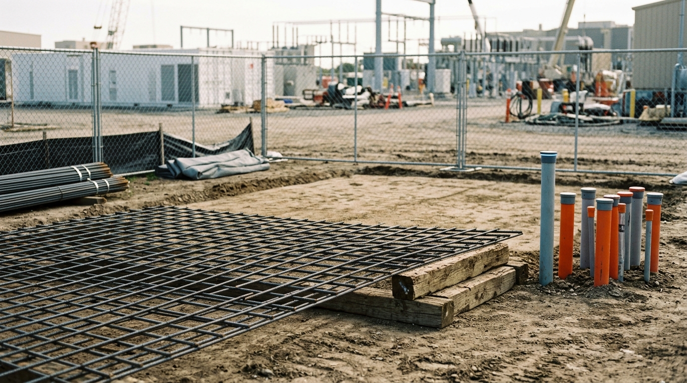
The more important point for this article’s argument is not whether either claim comes true on schedule; it is what fusion has to beat even if it does. The naive framing treats “does fusion work” as the test. The evolutionary framing treats the actual test as economic invasion into an already-occupied niche: fusion is not entering an empty ecosystem, it is trying to displace an incumbent lineage whose own cost keeps falling out from under any target painted on it. Way et al.'s own Fast Transition forecast for 2050 gives the moving target a number: the paper’s ninety-five-percent confidence interval for solar’s levelized cost of electricity in 2050 under that scenario runs from roughly two to forty dollars per megawatt-hour — a twenty-fold spread, but one whose upper bound is already below most fossil generation today [1]. A first-of-a-kind fusion plant, by definition, starts its own experience curve at zero cumulative production, the same position solar occupied in 1958 before three orders of magnitude of cost decline played out over sixty-plus years [1]. Whether fusion can compress that same multi-decade experience-curve descent into a narrower window — and whether its own learning rate, once a real fleet exists to measure one from, turns out closer to the roughly-ten-percent-per-year, twenty-percent-per-doubling regime of solar and batteries or to the flat-to-rising regime of nuclear, its nearest engineering relative in the historical record — is an open empirical question this article’s sources do not yet answer, because the data those sources would need does not exist until a fusion fleet exists to generate it. That is the founder-effect problem any late-arriving lineage faces: it is not enough to prove viability once; it has to out-learn, generation after generation, a competitor that has already had a sixty-year head start on compounding.
By 2100 the S-curve arithmetic permits several distinct worlds, and each has a name attached to it
Put the pieces together and 2100 stops being a single destination and becomes a small set of named, falsifiable destinations, each reachable under stated assumptions that this article has tried to attribute rather than assert.
Under Way et al.'s Fast Transition — fossil fuels phased out by roughly 2050, solar, wind, and batteries continuing their measured learning rates through saturation, and hydrogen and other power-to-X fuels covering the hardest-to-electrify remaining demand — the paper’s own system model shows electricity’s share of final energy rising sharply as almost all energy services eventually trace back to solar and wind generation, delivered directly, through batteries, or converted to storable fuels, and total system cost lower than continuing with fossil fuels at every discount rate the paper tested [1]. Under a continuation closer to No Transition, the same model shows a system that remains recognizably like today’s for decades, with low-carbon sources growing only slowly against a still-dominant fossil base — a trajectory whose emissions profile sits closer to the IPCC’s higher-forcing SSP3-7.0 or SSP5-8.5 pathways than to its low-emissions alternatives, without this article claiming the two frameworks were built to correspond precisely [1] [5]. And under the nuclear-dominant pathway Way et al. constructed specifically as a costed contrast case, the arithmetic is direct rather than rhetorical: roughly twenty-five trillion dollars more expensive than doing nothing differently, at the discount rate the paper treats as most appropriate for long-horizon public decisions — a lineage the cost data itself selects against, independent of any argument about safety or waste that this article has not evaluated [1].
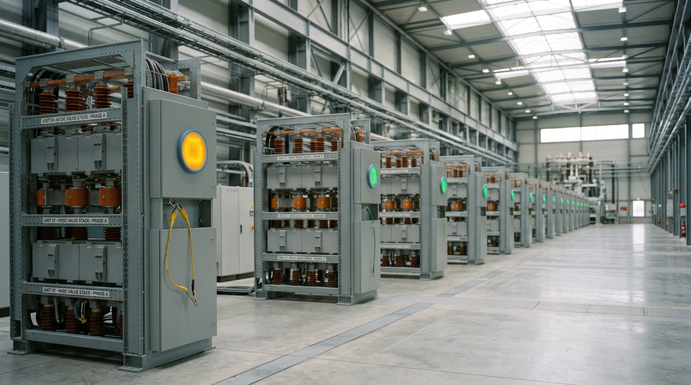
None of this is a claim that the future is settled. It is a claim that the shape of the disagreement is now measurable rather than rhetorical. Every one of the numbers compounding toward 2100 in this article belongs to a named source that stated its own method, its own assumptions, and — in Way et al.'s case explicitly, and by construction in the IEA’s and IPCC’s scenario families — its own uncertainty. Civilization has run this experiment three times before, over wood, coal, and oil, each substitution taking decades because the underlying manufacturing and infrastructure base had to be rebuilt physically, pad by pad and hall by hall, not merely decided on paper. The fourth substitution is running on a lineage that, uniquely among the four, gets measurably cheaper every time the population doubles, which is the one property that makes compounding do the work that policy alone has never reliably done. What happens next is not a matter of which side is right about the future in the abstract; it is a matter of which named forecast keeps clearing its own falsifier, one doubling at a time, and the record so far belongs to the curve that was never a straight line to begin with.